Wisconsin is another team that had a very good uniform but then tried to get too cute with it. They had everything in their previous uniform that was nice. Good lettering, stripe down the side that matched and then went around the pant leg. It was a clean solid look.
Then they followed it up with this uniform. The good is they kept the lettering and they still have the classic W logo on the uniform. Also, the side stripe matches from the jersey down to the pants. That is where the good things stop.
Please explain to me why they did the great thing of having the side stripe through the whole uniform and then they screw it up at the end. First, why does it look like the stripe is taking a turn around a corner? It’s like they thought this stripe needs something more! Let’s have it turn and then only go around the front. I haven’t seen a stripe curve like that very often. I have seen only the stipe in the front and still can’t understand it. It just makes everything look incomplete.
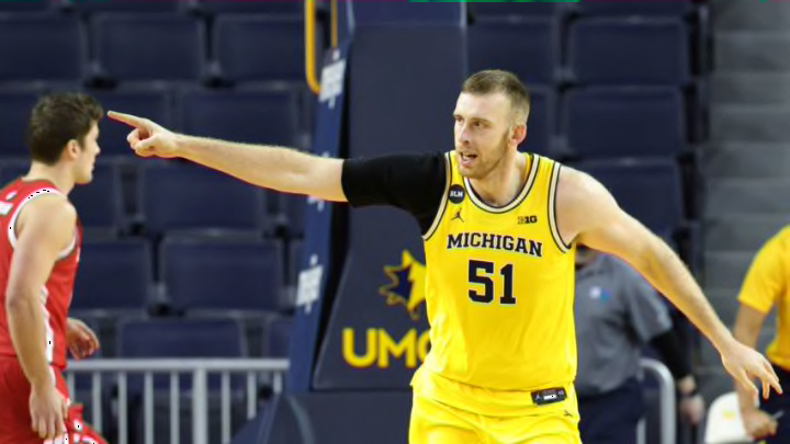
Then you go up and look at the collar and armholes. Why split up the stripe there again? Have it go all the way around. I love the stripe at the collar and armhole, it really outlines it and makes it pop. Just look at Michigan’s. But this stopping it and splitting up makes no sense.
Fix those two things and this is a strong uniform. But keep tinkering with it and they will continue to fall down the rankings of Big Ten uniforms.
