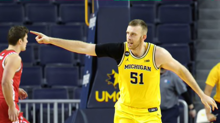
Michigan Basketball: Wolverines lead the way in Big Ten uniform rankings
By Adam Childs

team. 483. . . . Hawkeyes . 4
Iowa has a solid uniform. The name on the front is in a little bigger font than a lot of the teams in the Big Ten but with only four letters it works. The yellow outline around the letters and the number really makes it pop it looks good.
On the yellow jersey, they have it outlined in white which again makes it pop and is a very good look as well. The black collar is a good mix of color on the white and yellow jerseys and the yellow collar on the black makes them all look good.
I even like the design on the side of the uniforms. They look like part of an arrow going down on the jersey and up the shorts. It is a little weird they are going in the opposite direction but it works. They also are able to get the Hawkeye logo on the side of the pants and it also shows ups on the front of the waistline. All in all, it makes for a very clean and good look for a uniform.
They could climb a little higher if it weren’t for some very classic and good looks ahead of them. They also lose points for trying to wear grey uniforms with the Hawkeye logo replacing Iowa on the chest. This has been tried before and it just does not look good. Also going grey to just go grey is also a mistake especially when you have such a great color combination in yellow and gold. Leave the grey for teams like Ohio State who actually have it is as part of their color scheme.